Proportional fonts in Emacs
This article aims to be a definitive reference for the use of proportional fonts in Emacs, with emphasis on programming. In Emacs proportional fonts are called variable-pitch faces. (More pedantry can go here, but I’ll spare myself from writing it.) Regardless, I’m going to call fonts whose characters do not have a fixed width proportional fonts. Non-proportional fonts are also called monospace fonts. I’ll discuss why we want them, and how well Emacs supports them.
Why proportional fonts?
Simply put, proportional fonts are better than monospace fonts, even for programming. This is the case at least for Latin or Greek scripts and mathematical symbols, which is what I’m using. This fact partly due to the greater liberty that proportional fonts allow. Speaking from personal experience, I invariably feel more comfortable reading text typeset in proportional fonts rather than in monospace fonts. Besides, proportional fonts tend to use less horizontal space than monospace fonts, saving precious screen space.
However there can be reasons for using monospace fonts. Such reasons are originally only technical. In particular, early printers and terminals could only support displaying characters at fixed positions. Such devices are no longer in common use, but they influenced software strongly enough that the monospace assumption persists to this day in many contexts. In sum, there is a cultural bias for using monospace fonts, in particular for programming. I want to experiment and ignore this cultural bias as much as possible. As an Emacs user, I could customize it to use of proportional fonts as much as possible. I’ll report here where I faced technical limitations.
Successes
Graphical Emacs backends support displaying proportional fonts. The main kind of problem that we face is that proportional fonts break the assumptions of certain Emacs packages, and source files.
Programming
The main problem that we face is that programmers very often take advantage of monospace fonts to align code, typically by padding code with extra spaces (or tabs). There are two classes of alignments: alignment relative to the start of the line (widely known as indentation), and what will call tabular alignment.
Indentation
The problem of indenting with proportional fonts is that the space
character is typically narrower than most other
characters. Consequently, an indented line can appear to have a lower
indentation than it actually has. An idea is to use a font with large enough spaces, but even then lines will not line up exactly. This
isn’t a huge problem if indentation needs only be correct relative to
other indented lines, but it becomes very significant if indentation
must be correct relatively to a less indented line. For instance,
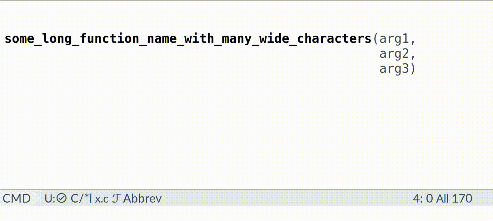
arg1, arg2 and arg3 are alined in the example below,
with a monospace font, but they won’t be with a proportional one.
some_long_function_name_with_many_wide_characters(arg1,
                                                  arg2,
                                                  arg3)
This sort of alignment convention is found in many languages. For instance it pervasive in lisps. In some languages, such as Haskell, it is even meaningful for the compiler. So it must be taken care of. Fortunately, there is an solution to this issue. It suffices to set the width of space characters belonging to the indentation to be the same as the width of the character directly above them, like so:
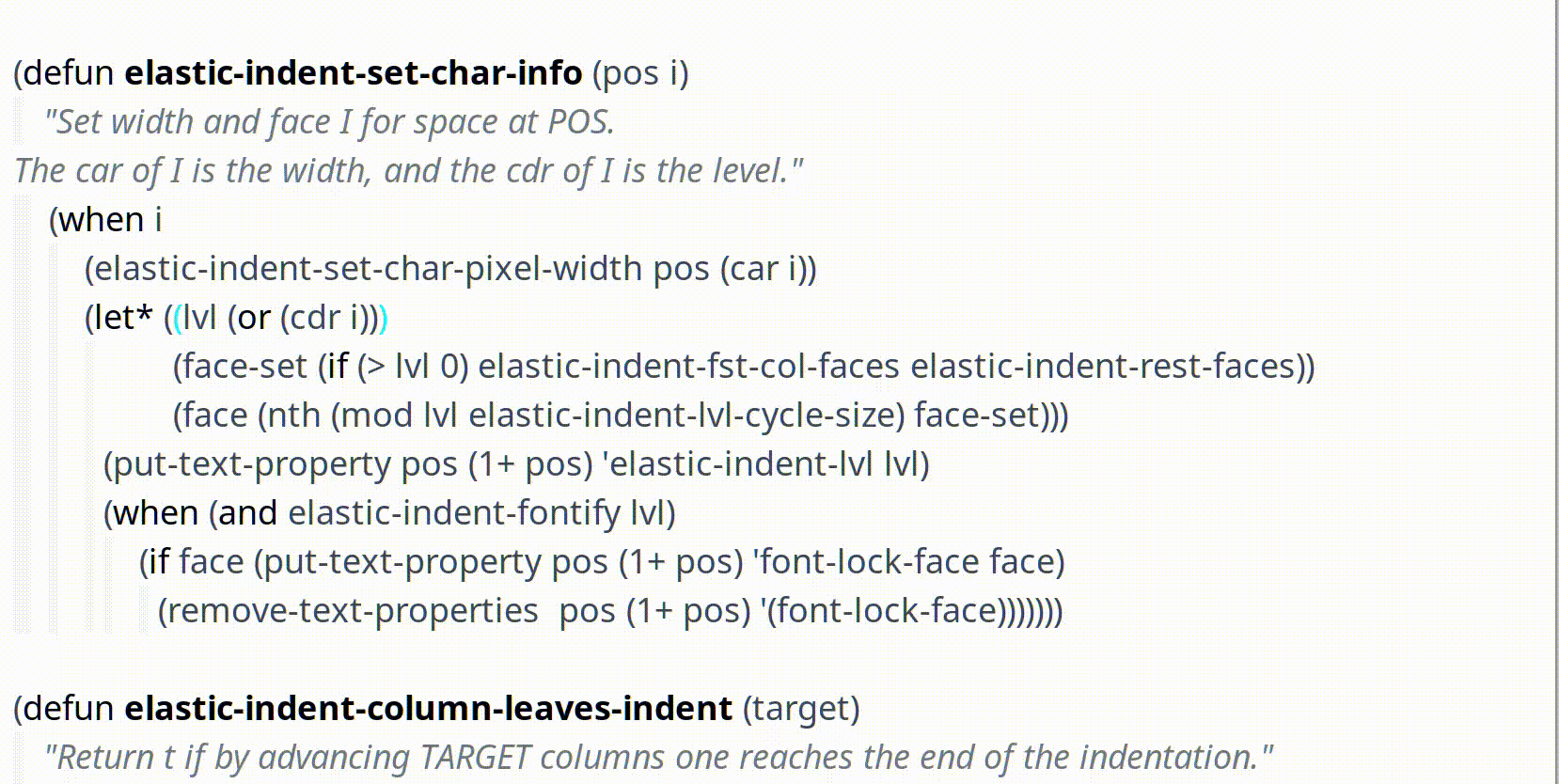
It is possible to implement this as a package, because Emacs provides means to query the pixel size of displayed characters. Some further complications happen because indentation is sometimes implemented by tabulation characters. The solution is to treat each tabulation character as the spaces that it would stand for in a monospace context.
This idea was proposed and implemented by Scott Messick. I added support for tabs, optimized it and added support for indentation guides, resulting in the elastic-modes package. This package also supports tabular alignment, discussed below.
Tabular alignment
The second kind of alignment is constituted of table-like pieces of code, such as:
some_variable       = value1
some_other_variable = value2
a_third_variable    = value3
Unfortunately, simply changing the widths of space characters does not work to preserve this kind of alignment, because each line in the table involves different non-space characters in general. Fortunately, this kind of spacing is typically insignificant, even in Haskell programs. So, for this kind of application, it is possible to use elastic tabstops. The idea is to use tabulation characters to separate columns in the table, and let the editor align the columns. (The link above shows elastic tabstops in action.) A pleasant characteristic of this convention is that it mimics one of the original uses of tabstops on typewriters. Consequently, in some situations the table may be displayed correctly in an editor which uses plain tabstops and a monospace font.
Org-mode
Org mode’s purpose is mostly to input free-form text, and as such does not suffer from much cultural bias towards monospace. You will however want to configure Emacs to use a monospace font for certain elements, such as check-boxes and tables (See below).
Medals
Some packages already have special support for proportional fonts. I’d love it if this were the beginning of a trend and it would be expected for packages to support proportional fonts.
Vertico 🏅
The Vertico package has special support for proportional fonts: it correctly aligns the annotations provided by marginalia!
Info 🥈
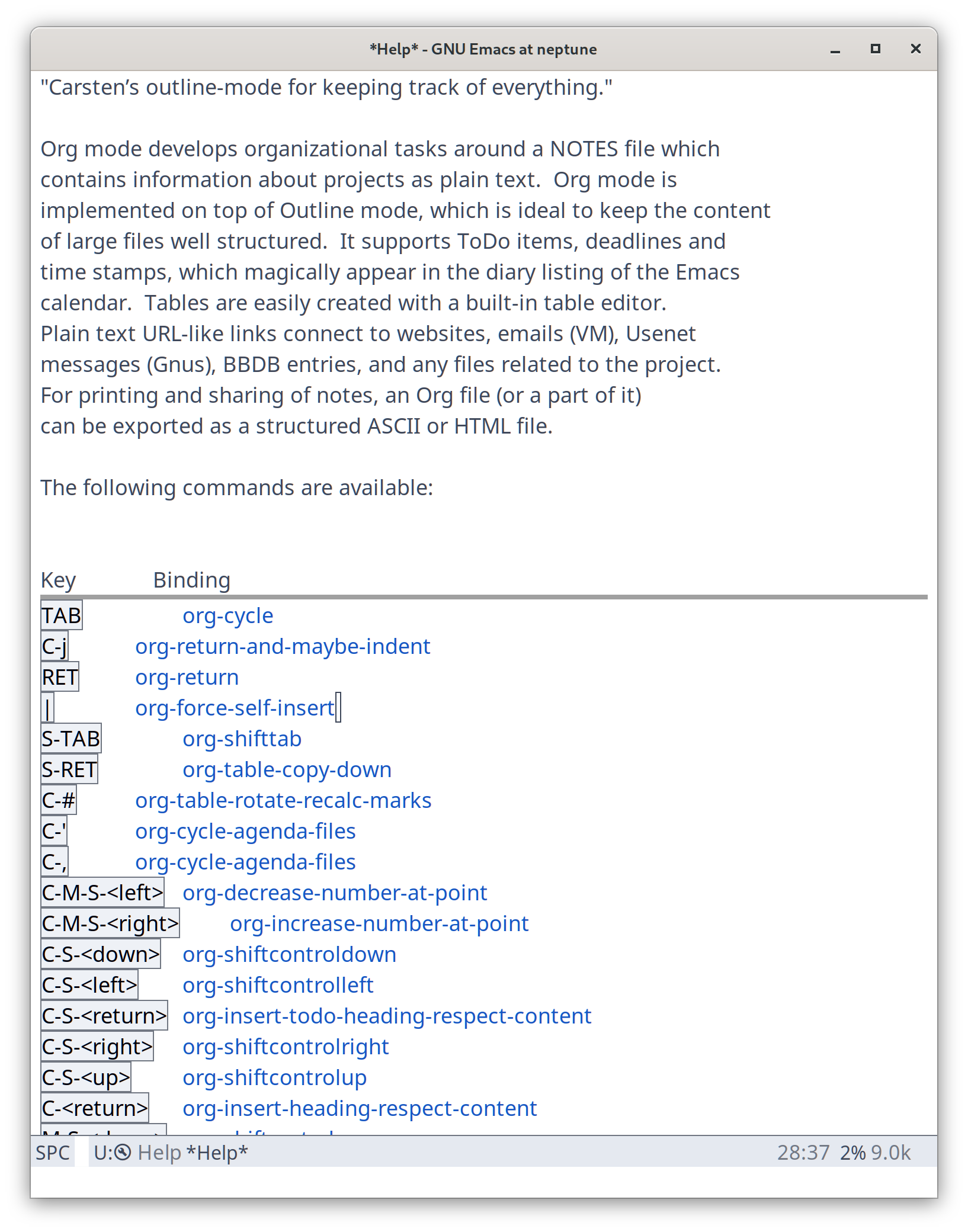
The standard info package correctly aligns menus.
Bugs, workarounds and shortcomings
Former bug in window-text-pixel-size 🐛
The technique to query the size of a character (or any text) in pixels
involves using the window-text-pixel-size function. Unfortunately it is buggy in
Emacs 28 and 29.1. One of the problem is witnessed by the following example. (Update: this particular bug is fixed in Emacs 30!)
Copy it in a scratch elisp file and evaluate the last line:
;m some text here
;x
;^--- 2nd character of following lines have wrong
; window-text-pixel-size if measured on their own.
;;note presence of NARROW NO-BREAK SPACE in the 1st line

(window-text-pixel-size nil 19 20) ; returns (0 . 27)
Fortunately, as far as I can tell, this bug can always be worked around by computing the size of multiple-character regions which overlap and subtract them. I have implemented this workaround in elastic-indent-mode with good results so far.
Bug in org-mode tables 🐛
Org-mode tables do not work with proportional fonts because org-mode automatically pads them with several spaces. At the time of writing, the algorithm which does this padding appears to assume a monospace font, and thus computes incorrect results for proportional fonts.
Unfortunately, the bug goes deeper. Indeed, if you set your default
font to proportional, but set the org-table face to be monospace,
you get wrong results. This appears to be due to org-mode attempting
to deal with double-width characters. If you don’t use those, then
the following workaround seems to fix the problem:
(fset 'org-string-width 'org--string-width-1)
Agda 💩
The Agda mode appear to apply its own styling in a non-standard way, overriding the spacing set with elastic-indent-mode.
Shortcomings 🤷
The following packages and functions would benefit from special support for proportional fonts. This is not an exhaustive list (yet), just a few things that I personally use or that I was made aware of.
- Org-mode code blocks can be configured to be fontified “natively”. This means that the normal major mode for the code block will be used for fontification. Org-mode does this by creating a temporary buffer with the contents of the block, set the appropriate major mode it it, and copy the propertized text into the block. Unfortunately it does so at each keystroke, and the process of computing elastic indentation is too slow for that. (Currently it is done somewhat lazily.) So, it is currently recommended to use a monospace font in org-mode source blocks.
org-calendarshows incorrectly aligned columns in the calendar view.marginalia: if the marginal data is multi field, then the corresponding columns are not aligned. (See for exampledescribe-commandwith marginalia enabled.)which-keyshows incorrectly aligned columnshelmshows incorrectly aligned columnsdiredshows incorrectly aligned columns. (But it’s unclear if it can adapt at all to proportional fonts.)describe-faceshows incorrectly aligned columns- In the Emacs manual, the description of keymaps are not aligned properly.